

Color editing is often referred to as color grading. “Color grading is the process of improving the appearance of an image for presentation in different environments on different devices. Various attributes of an image such as contrast, color, saturation, detail, black level, and white point may be enhanced whether for motion pictures, videos, or still images.”
Color grading can dramatically improve or alter your work in eye-catching ways. Nearly all professional photographers in this world will color grade, excluding niches such as journalism in which altering the scene is frowned upon.
Here is our ultimate guide on how to color grade like a pro using Adobe Lightroom CC and Photoshop CC!
Shoot in RAW Mode
Whenever you need to do extensive color grading, or full recoloring of an image, shooting in RAW mode will help you tremendously. When a photograph gets recorded as a file format, it becomes compressed to fit within that format, and you may lose some quality or some forms of editing capability. Basically, RAW contains direct image data from the camera sensors with no loss of quality or alteration. This stores the fullest details of an image.
This uncompressed, organic information is key to bringing out beautiful colors. The colors will look like they were intended to be there, and you won’t have weird discrepancies come out in the file as you edit. Such discrepancies include random purple outlines on your subject (called fringing) or noise (caused by a high ISO level).
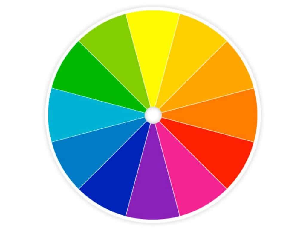
For Your Reference, Here is a Color Wheel
To make it easier to reference back, here is a copy of the standard RYB color wheel. The primary colors are red, yellow, and blue. The secondary colors are orange, green, and violet. Tertiary colors are red-orange, yellow-orange, yellow-green, blue-green, blue-violet, and red-violet.
Color Harmonies to Remember
There are seven color harmonies, also known as schemes, to remember. These are based on color theory, which is a set of rules and guidelines for the use of color. How do you color grade will fall into at least one of these harmonies.
- Complimentary: Colors that are opposite each other on the color wheel are considered to be complementary colors.
- Analogous: Analogous color schemes use colors that are next to each other on the color wheel.
- Triadic: A triadic color scheme uses colors that are evenly spaced around the color wheel.
- Split-Complementary: The split-complementary color scheme is a variation of the complementary color scheme. In addition to the base color, it uses the two colors adjacent to its complement.
- Rectangle: The rectangle or tetradic color scheme uses four colors arranged into two complementary pairs.
- Square: The square color scheme is similar to the rectangle, but with all four colors spaced evenly around the color circle.
- Monochromatic: One color in different shades.
How to Color Grade in Adobe Lightroom
Arguably, Adobe Lightroom is one of the easiest ways to color grade, specifically because of the slider functions. Lightroom is strategically laid out to offer you all of the tools available in the easiest format possible. Although many assume Photoshop is really the prime program for photographers, Lightroom is actually Adobe’s dedicated photography editing software.
For this tutorial, we are using Adobe Lightroom Classic CC. This works the same way in Adobe Lightroom CC. Our version is 10.1.1, which came out in 2020.
First thing is first, go ahead and load your image into Lightroom and click the Develop tab in the upper right-hand corner. A screen such as this should appear:
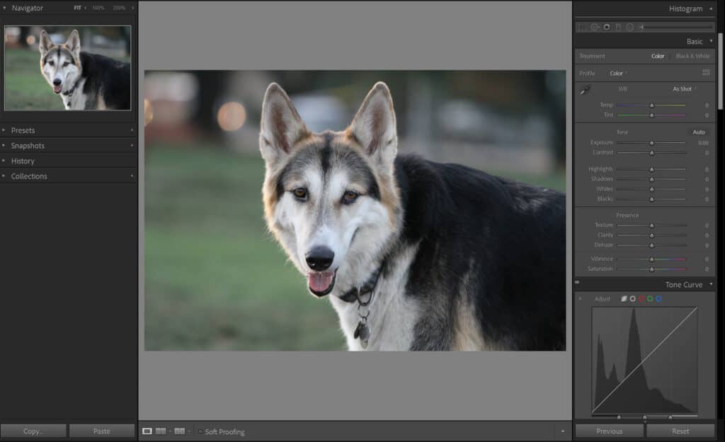
Intuitively placed, the panel you see on the right-hand side dictates what order you would likely want to do your editing. That being said, remember that when you’re editing colors using hue, saturation, luminance, and vibrance (which we will get to in just a few moments)- they’re not the only variables that affect your colors. Shadows, Highlights, Whites, Blacks, and Contrast also change how your colors appear. These are their own individual sliders, as seen here.
For example, if you lower your color saturation or vibrance and then increase the contrast, you’ll notice that the colors become vibrant and intense again. Likewise, if you increase saturation or vibrance and then darken the image, the colors become muted again.
Pay attention to how your other edits affect the colors. For the sake of workflow, make sure you adjust your shadows, highlights, white, and blacks first before moving on to the actual color grading. Here, we have made our adjustments in the first major panel:

Notice that we also have a Vibrance and Saturation slider. Although we didn’t use it above, it is important to understand the distinction between the two terms before moving on to editing colors.
In photography, saturation refers to how pure a color is. How blue is the blue? You can imagine color being “absorbed” in the photograph like a sponge, with a higher saturation resulting in a more significant color.
On a technical level, saturation is actually just a description of how intense or dull the light of a specific frequency or wavelength is coming from a light source. This is actually why the color of an object changes as its light source changes, despite the object always having the same color.
Vibrance is actually a bit of a complicated explanation, believe it or not. That’s because ‘vibrance’ isn’t actually real.
Vibrance was actually invented by Adobe (Lightroom and Photoshop) for their editing software. Adobe created the term vibrance in order to distinguish between the Saturation slider and the Vibrance slider.
From Adobe’s own description, “Vibrance adjusts the saturation so that clipping is minimized as colors approach full saturation. This adjustment increases the saturation of less-saturated colors more than the colors that are already saturated. Vibrance also prevents skin tones from becoming oversaturated.”
If you’re stuck trying to figure out whether to use Saturation or Vibrance for your photograph, just remember this simple distinction between the two: If all of the colors in the photograph are quite even in their intensity, then saturation is best. If you have colors that are all different, vibrance is the way to go.
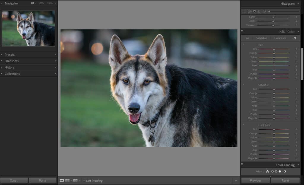
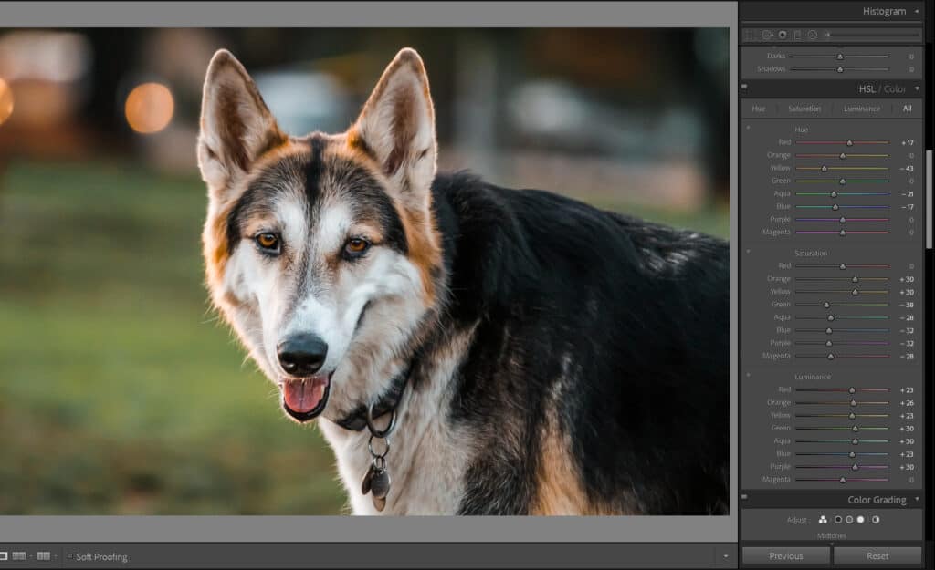
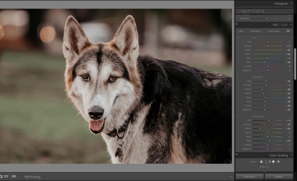
After you are done with the above panels, use the scrolling bar to move down a little until you see a panel titled HSL (which stands for Hue, Saturation, and Luminance). By default, only one of the color panels is open, so it is suggested to click All and leave it on that by default. Your window should look like this:
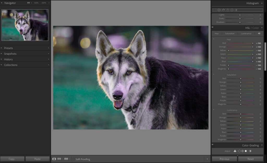
This is where a lot of the magic begins. The first part you will see is titled Hue. Hue is often the first color adjustment offered to you.
The Hue is the shade of a color on a gradient. In technical terms, the hue is the wavelength of the light reflected. This describes why an object that is one solid color can change its color depending on the light or the amount of light that hits it.
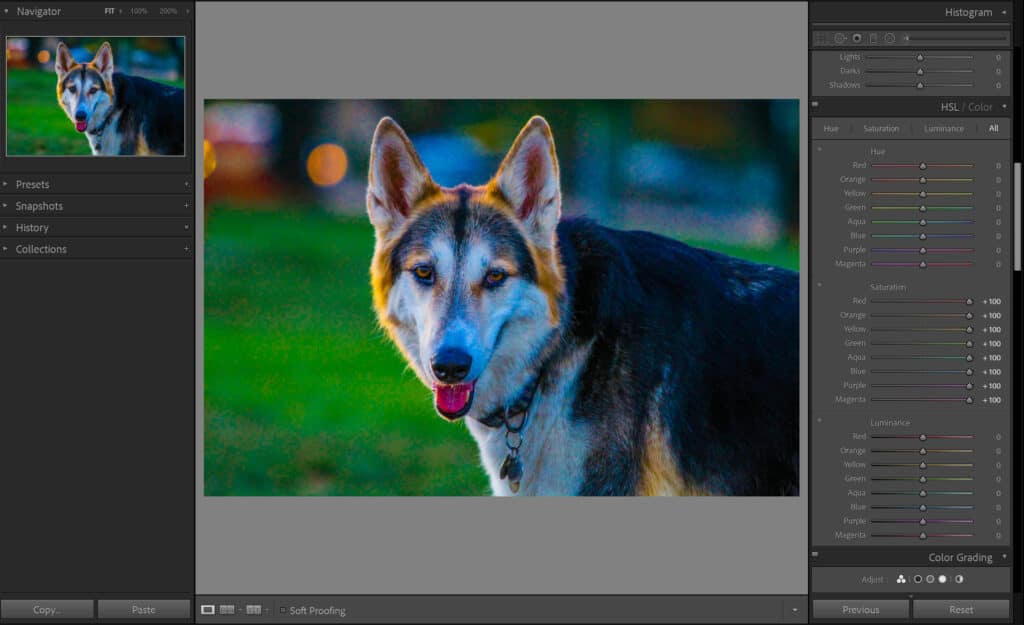
The hue can change how specific colors look. For example, the yellow shirt can be made to be more orange in color. Here is an extreme example to show you how those sliders impact:
Next, we come to Saturation. We described saturation above, but this particular window allows you to do the saturation of just individual colors rather than the whole photograph.
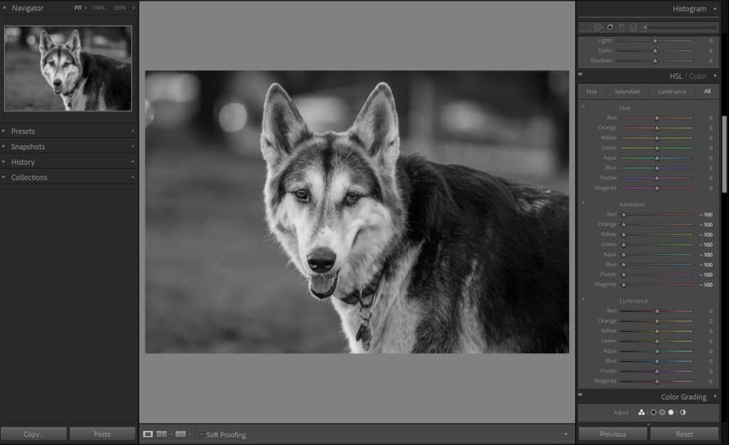
Finally, we hit Luminance. Luminance lightens or darkens a specific color. Luminance refers to the reflective brightness of colors. This slider is frequently utilized to make certain colors in a picture more prominent or less prominent.
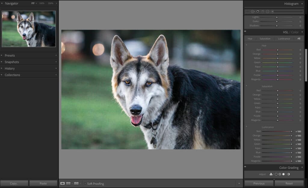
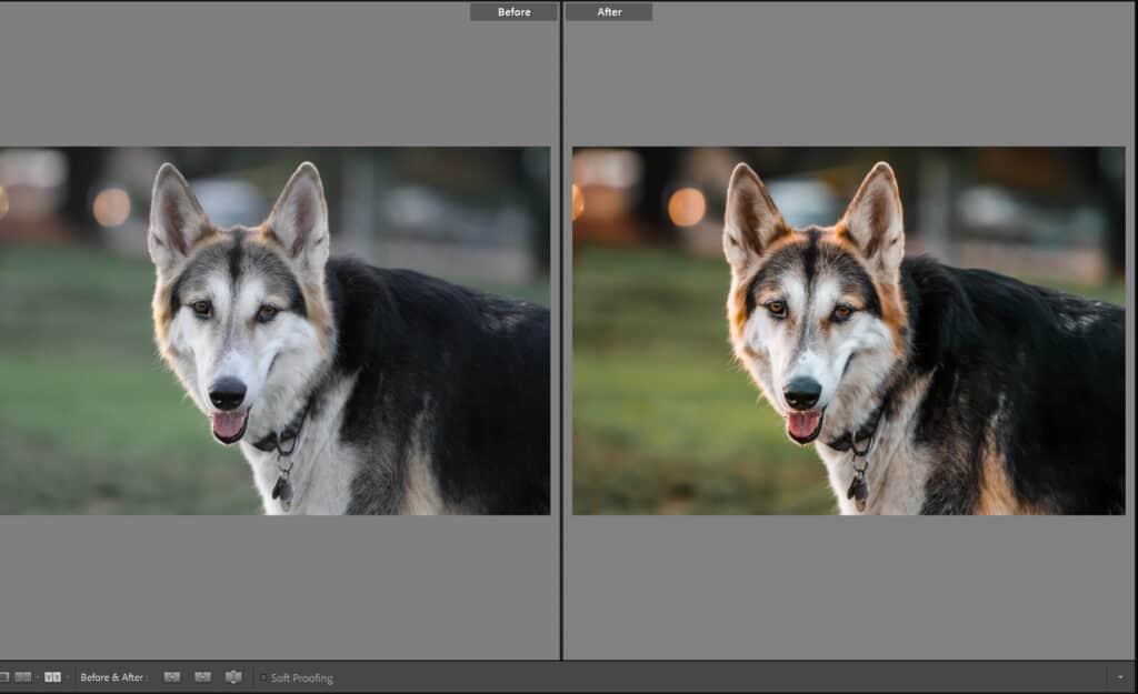
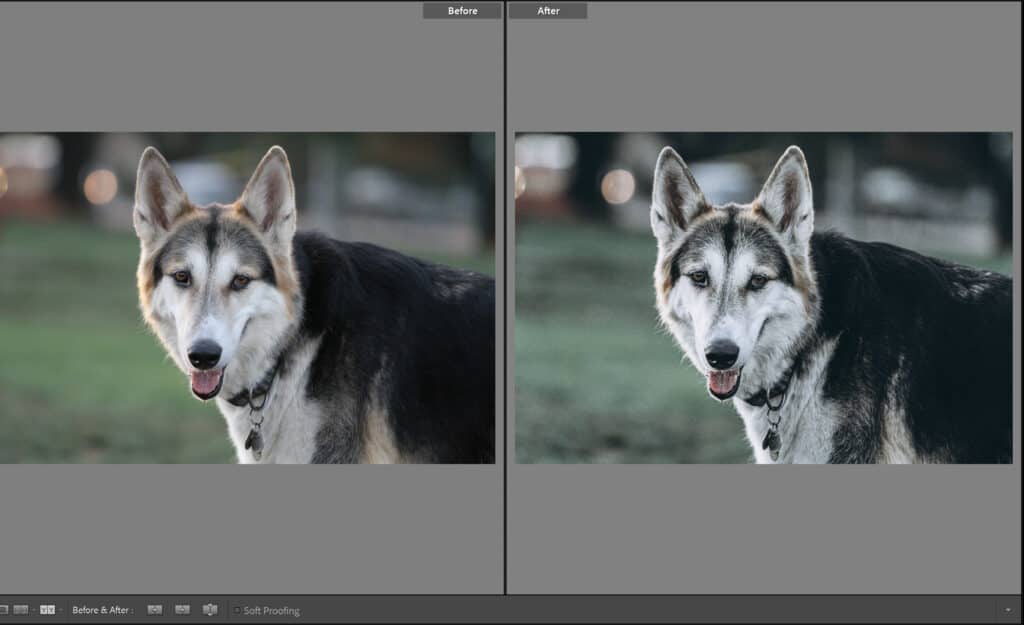
To show you how we used an acceptable amount of all of the sliders, here is a color grade that is based on just the above color sliders!
It’s good practice to constantly do a Before / After to see what you’ve done (and prevent you from going too overboard). You can select the Before / After window in the bottom left-hand corner.

But what about those significant recolors that some people do? Well, my friends, they do this in the dedicated Color Grading window. Scroll down just a little bit, and you’ll see it! This is a brand new feature in the new Adobe CC. Once upon a time, this section was called Split Toning. Split toning is when you color your shadows and color your highlights independently from one another. Color grading includes this same concept but also adds the option of recoloring the Midtones as well.
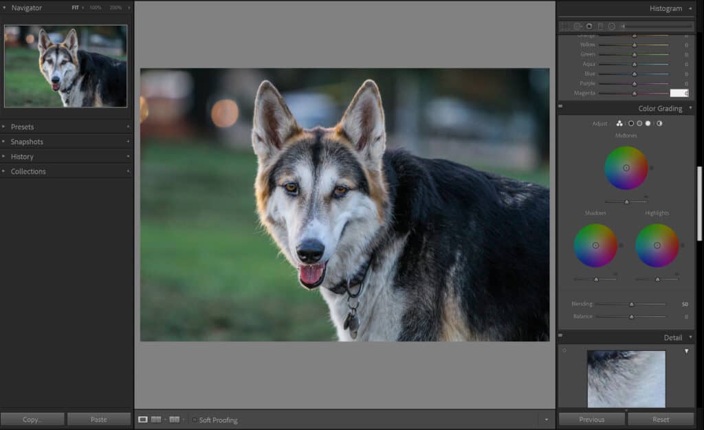
This window can be the most difficult to utilize because it’s easy to make your image look terrible. Color harmonies come into play significantly when you color grade using this window because colors that work together play best on your image.
All you do is click on the rainbow color wheel and begin to slide your cursor around until you find the color tone you fancy. Don’t worry if you go back and forth frequently; that is a part of the process!
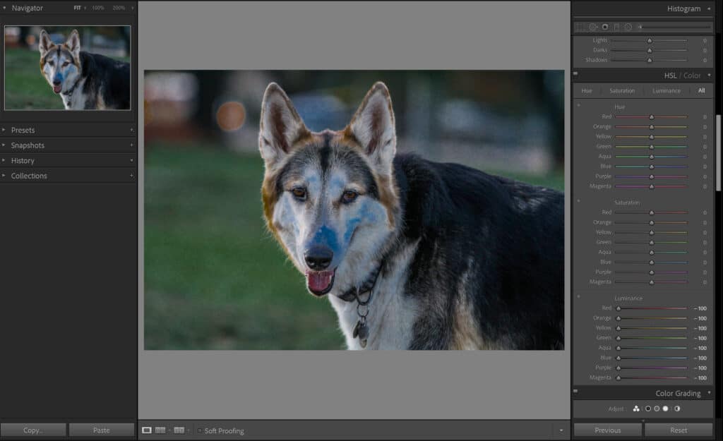
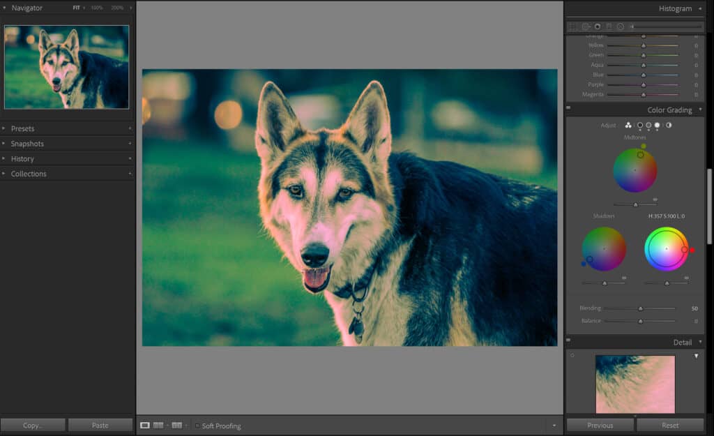
Terrible grade:
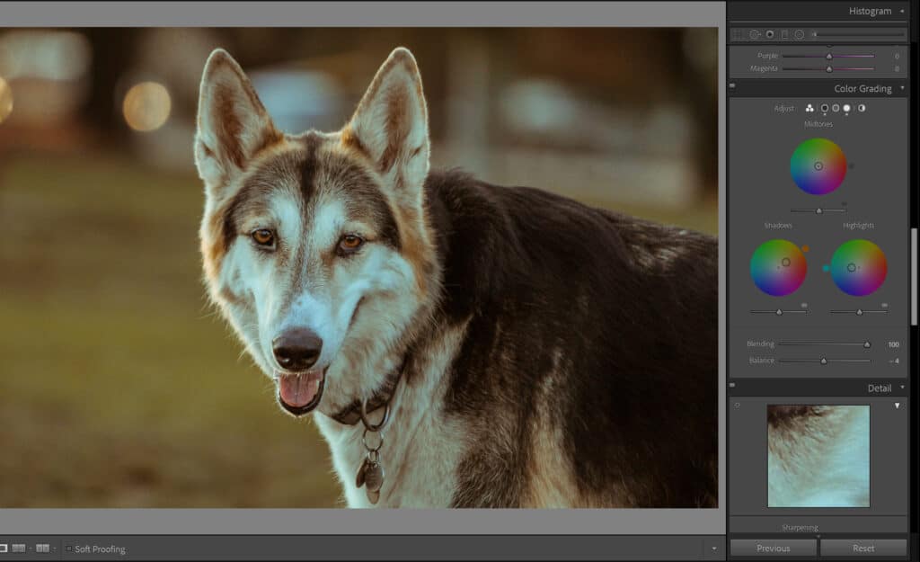
Good grade:
With the above tools now firmly in your arsenal, you can use all of the sliders to create the exact image of your dreams!
How to Color Grade in Adobe Photoshop
Typically, Lightroom and Photoshop come together in a bundle. If they did not, and you prefer Photoshop, you can color grade here similarly. If you are shooting in RAW mode, then the Camera RAW Editor will open up, which looks nearly identical to Adobe Lightroom Classic CC. You will see all of the same sliders, including the Color Grade window!
If you shoot in JPEG and open it in Photoshop, it may be a bit more difficult. In order to find all of the same panels, you will need to follow the below steps:
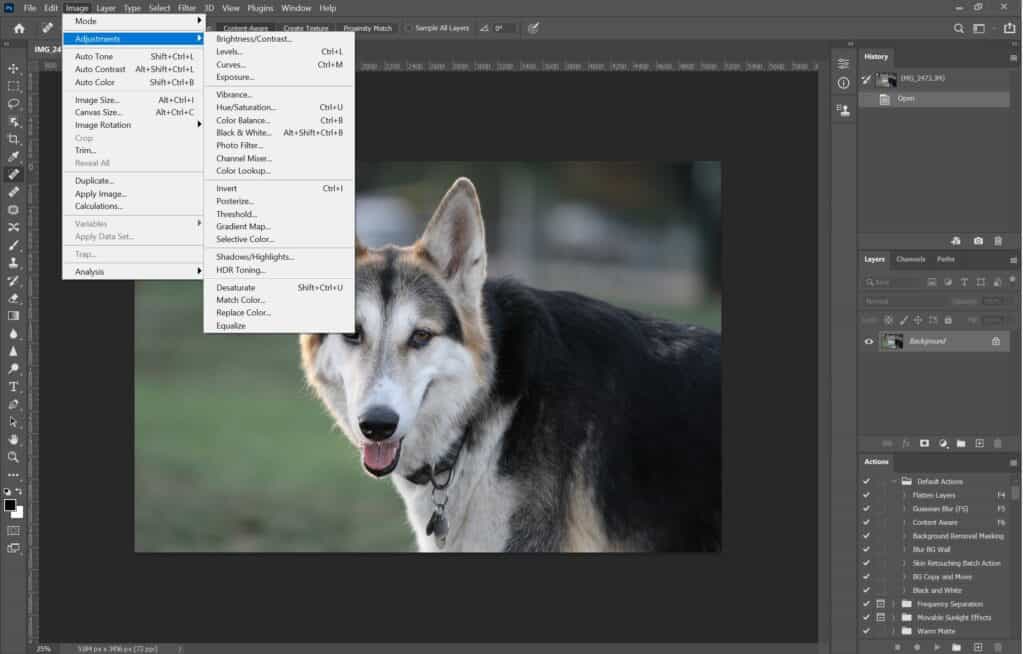
You won’t find a Color Grade panel, but the rest all do the trick!
The Difference in Mood Based on Color
The colors you use for your photography will impact how a viewer interprets your work. If you make the colors too saturated with a moody picture or lack vibrancy for an exciting picture, your audience won’t be able to understand your photograph. Here are some examples of the above photograph edited in different moods. See how the images make you feel!
Things to Keep In Mind
There are a few tips to keep in mind when color grading.
- Frequently refer back to your Shadows, Highlights, Whites, and Blacks sliders. If you aren’t able to achieve the colors that you want, it may be due to the above four settings.
- It’s not a bad idea to adjust your color temperature (located in the White Balance slider) to see if you want your image to be warm or cold.
- Match your color grading to your image subject to avoid confusion in the audience.
- The HSL (Hue, Saturation, and Luminance) slider has its limitations. For example, the hue of a color can only be changed to the nearest two colors to it on either end of the color wheel.
In conclusion, mastering color grading can really take your work to the next level and bring your wildest visions to life!