
If you’ve been dabbling in photography for any amount of time, some common terms may have crossed your path. From exposure to composition, a lot of terminology pertains to the visual representation of an image. Contrast is one such common word, used to describe how a photograph looks!
But what exactly is contrast? Few can accurately explain it. Here is our article on what contrast means in photography and how to use it effectively.
What is Contrast?
Contrast is one of those topics that tends to have a difficulty being explained.
In official terms, contrast in photography is the visual ratio of different tones in an image. In human terms, contrast refers to the difference each color, shadow, and highlight has with one another.
If each color, shadow, and highlight looks very separate from one another, that is generally seen as ‘high contrast’. Where every color, shadow, and highlight looks to be about the same tone or “flat”, that’s normally called ‘low contrast’.
This difference that is produced by contrast aids in creating the textures, highlights, shadows, colors and clarity in your photograph.
What Is Tone
You may have noticed that the term Tone was used to explain contrast. Tone is the overall lightness or darkness of a color. This can often be in relation to a color’s “warmth” or “coldness”.
Tonal range is the difference between the lightest and darkest parts of a photograph. Keep this in mind as we move forward with this article.
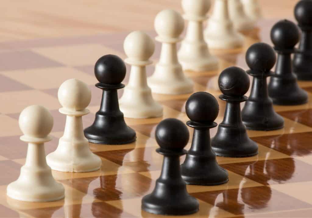
High Contrast

Images with high contrast have very clear distinctions between all of the tones in the image. Each part of the image is very clearly defined and stands out. These images will have intense colors and deep textures that create very ‘loud’ end results.
Low Contrast
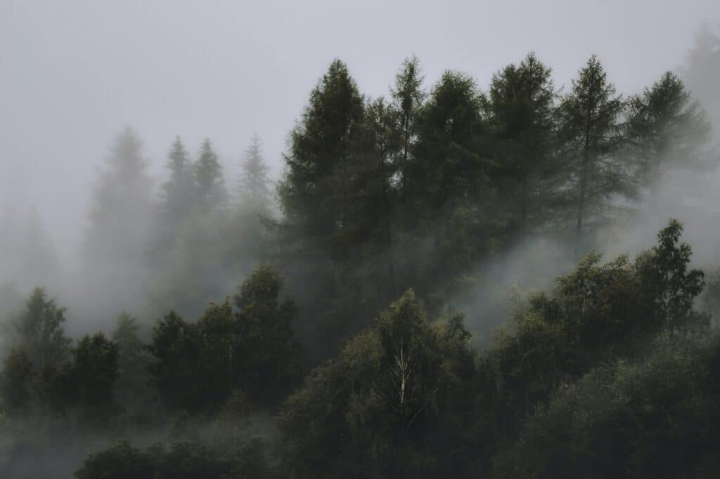
Low contrast is the direct opposite. A low contrast image holds little distinction between the lights, darks, and colors. This leads to a flat or soft photo. This dullness in the composition of lights and darks will mute the colors in the image.
Tonal Contrast

Much like the definition of tonal range, tonal contrast refers to the difference in the tones of your photograph. This primarily relates to the light and dark parts of your photograph rather than the colors themselves.
Tonal contrast is where the tones are what push the subjects within the photo out- making them appear defined or undefined through the brightness or darkness of the blacks, whites, and grays. Remember that all colors are made up of black, white, and gray, and the mixture of these dictate how the color appears.
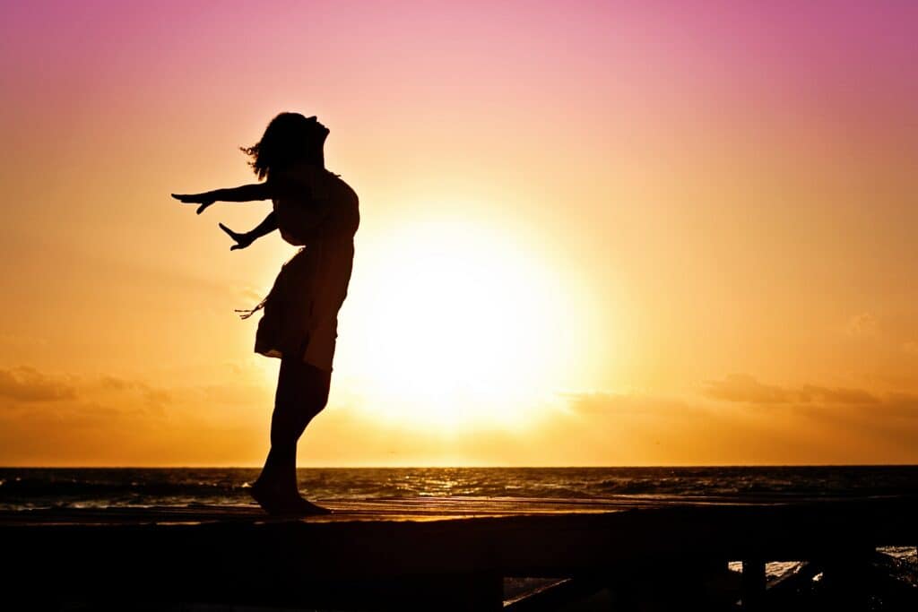
Silhouettes are a good example of tonal contrast. Silhouettes are created through a sharp difference between dark and light areas.
Tonal contrast is the most common contrast adjustment when it concerns post processing. When editing a photo’s contrast, the goal is to either increase the contrast to make an image more exciting and dramatic or decrease the contrast to make an image more ethereal and soft.
In editing programs such as Adobe Photoshop and Adobe Lightroom, you can use the contrast slider to either add contrast to your image or remove the contrast altogether. This contrast adjustment is tonal contrast, not color contrast!
Color Contrast
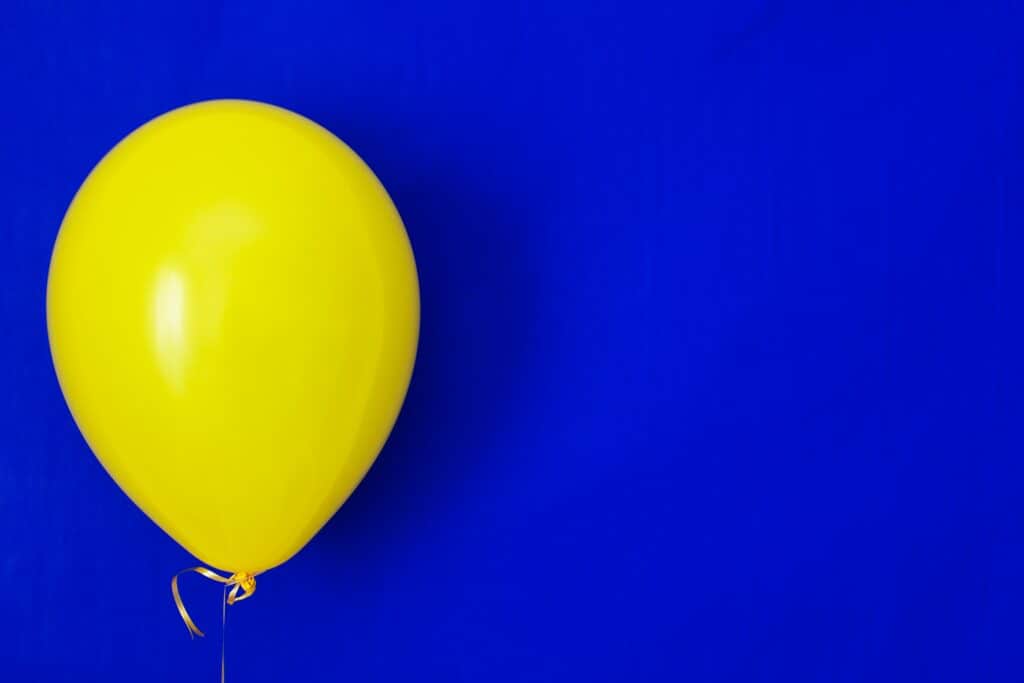
Color contrast is contrast created by the use of color rather than tones. Your subject pops out because of its color in relation to the other colors in the image, like in the image above. This is how you can achieve high or low contrast without editing- all in the camera!
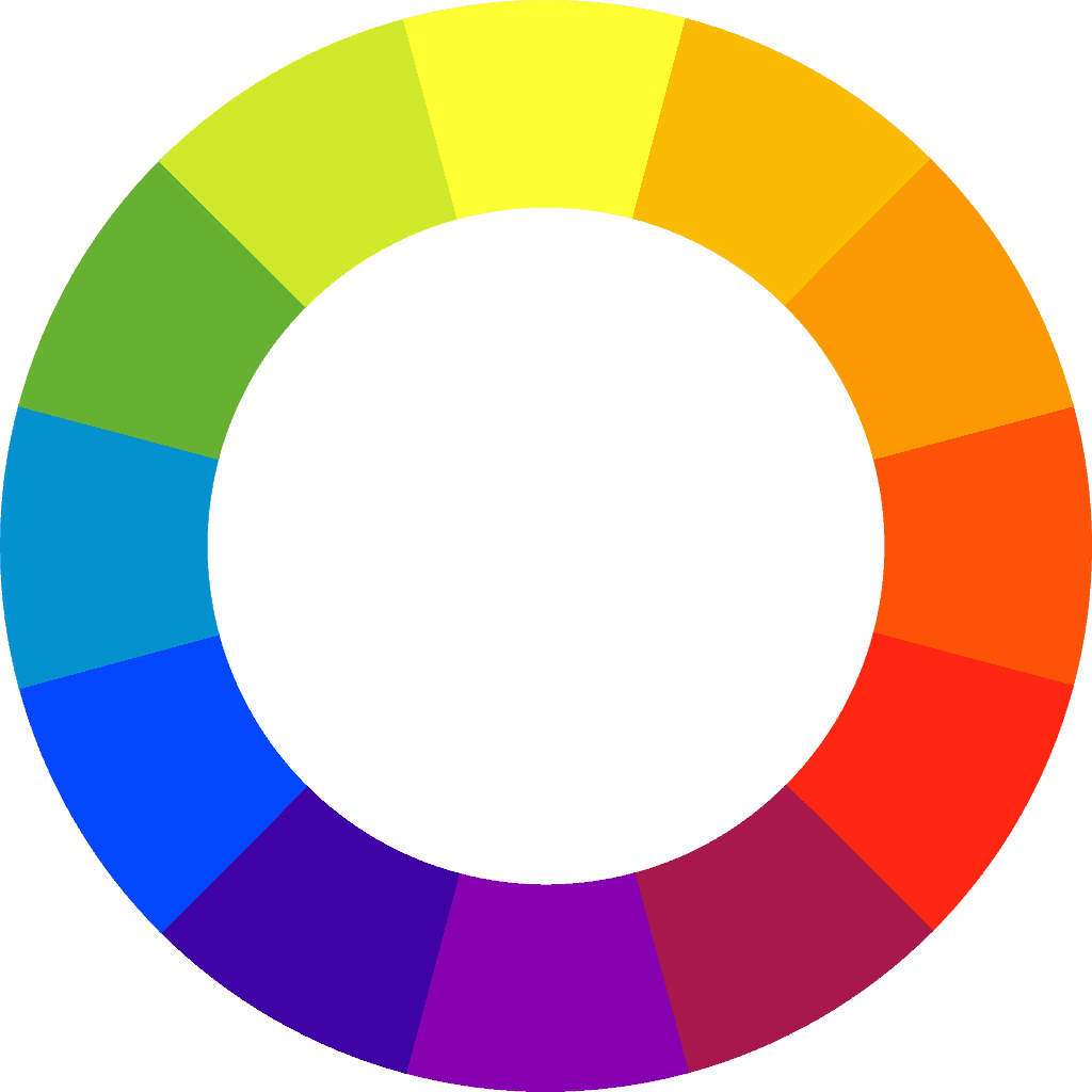
Color contrast is used to achieve great compositions. Colors with opposite characteristics, like blue and yellow, contrast strongly when placed together. This has to do with the color wheel. When two opposing colors are placed together they complement the qualities of the other color. When colors are very close to one another on the color wheel, they become more low contrast because the difference between the two colors isn’t very bold.
Conclusion
In conclusion, keep focused on your contrast in order to help tell the story of the photograph or set the mood for your audience!
Just remember that with color contrast, two colors on the opposite side of the color wheel create contrasting colors. Colors that lie next to or close to one another create less contrast. With tonal contrast, lots of grays in the image equal low contrast, lots of black and whites equal high contrast!