

The world of color surrounds us at all times- from the linens on our bed to the natural life outdoors. Color is one of the most prominent characteristics in our day to day lives, thanks to a series of biological adaptations in our eyes. With color being so prevalent in all that we do, we can certainly make an educated guess that color is even more important in art careers. For photography especially, color theory can make a photograph world-famous or break a great image down into nothing.
Color theory is a psychological concept that a series of color combinations impact our perception and response to something. Color theory involves understanding basic fundamentals such as what a color wheel is, the different types of colors, their schemes, and how they impact your viewer. By getting a good grasp on these ideas, you can excel in your photography work. Here is our ultimate guide to color theory, explaining why every photographer needs to understand it!
What is Color Theory Exactly?
To be very specific, color theory as a term refers to a collection of rules and guidelines for the use of color. Every creative industry from interior design all the way to painters and photographers utilize the concept of color theory.
You can use color theory to drive an emotion in your images, to train your audience to interpret a piece of work in a specific way. It can be the difference between a warm image being happy and that same image being cooled down and sad. With colors you can set a mood, attract attention, or make a statement. You can even use color theory to alter a composition!
The rules and guidelines that make up color theory aim to provide you with endless tools to make the most out of the power of color.
The Psychology Behind Color Theory
To understand the psychology behind color theory, we must first go back to the creation of these rules and guidelines.
Color theory was first established by Sir Isaac Newton, one of the most influential scientists of all time, when he invented the color wheel in 1666. Newton realized that color is actually entirely a human perception, it is not an absolute. This is because color is actually just wavelengths of light that we see in our own way.
The reason that color is a very subjective perception is because color is equally based on our biology, different species of animals see color differently than we do. On an even further note, we aren’t actually certain if the way that we see color is the same way that our best friend sees color, or our uncle sees color.
Newton proceeded to systematically organize colors into three groups: primary colors, tertiary colors, and secondary colors (which we will get into a little later on). In the process of organizing, Newton realized that it wasn’t enough to just categorize- colors are also dependent upon their hue, chroma, and lighting.
In the midst of discovering that, he naturally came across the psychology of color- that different colors elicit a different response in the viewer. “Color influences perceptions that are not obvious, such as the taste of food. Colors have qualities that can cause certain emotions in people.”
There are a slew of psychological studies that show how color can influence absolutely everything, even as far as the effectiveness of placebo medication! That’s because our mind associates color with certain characteristics and then makes an interpretation based on such. Red is danger, orange is energetic, blue is calm, that sort of thing.
How Color Theory Can Make or Break a Photograph
To take it back to photography, the wrong assortment of colors or the wrong hue and saturation can destroy your photograph. This is often due to one of two reasons: The colors do not match the subject matter portrayed or the colors look bad together.
For example, if you’re photographing a cute puppy playing with a ball, making the image cold by using lots of dark blues may not be the right choice. There becomes a conflict between the subject and the emotion brought forth by the color, leaving viewers disliking the image.
For situations in which colors do not match, that’s often due to the hues being wrong. Colors have to have similar hue in order to go together, generally speaking. Even so, sometimes you pick colors that really don’t work, which makes looking at an image uncomfortable for most audience members.
The Fundamentals
To best understand color theory, let’s talk about the fundamentals you need to know.
The Color Wheel
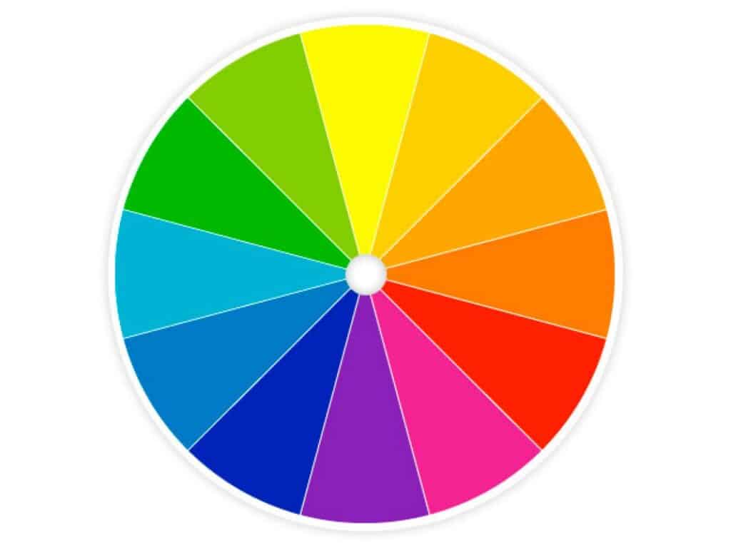
We all probably learned about the color wheel in grade school, but it’s easy to forget something like that when we don’t consciously use it every day.The color wheel is Newton’s way of sorting colors together and displaying their relationship with other colors.
The color wheel is designed so that virtually any colors you pick from it will look good together. Over the years, many variations of the basic design have been made, but the most common version is a wheel of 12 colors based on the RYB (or artistic) color model.
Make note that this doesn’t display all the colors under the sun, of course, but rather than distinct categories.
Primary, Secondary and Tertiary Colors
The colors on the color wheel are categorized as either primary, secondary, or tertiary colors. This is important to memorize when speaking about color.
Primary
Primary colors are the main colors.
Secondary
Secondary colors are achieved by mixing two of the primary colors together.
Tertiary
Tertiary colors are achieved by mixing primary and secondary colors.
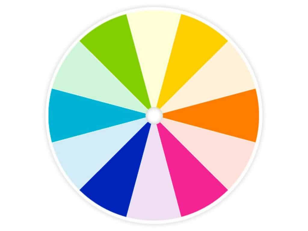
Warm and Cold colors
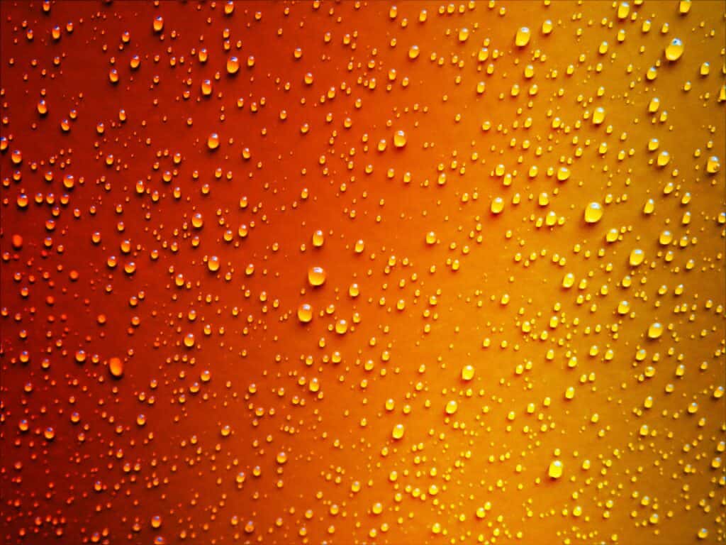
The colors on a color wheel can even further be segregated into warm colors and cool colors. What we mean when we refer to this type of temperature is that the perception of the colors is either warm and fiery or cold and wintery, so to speak.
Warm colors are vivid and energetic, and tend to advance in space. If you are to slice our chart in half, the warm colors on our wheel are located to the right hand side.
Cool colors give an impression of calm, and create a soothing impression.If you are to slice our chart in half, the cold colors on our wheel are located to the left hand side.
You use warm and cold colors to create a mood in your photography. For example, photographs of children tend to be warm while images of a moody woman can be cold.
Hue
How colors come across have to do with hue. When you refer to hue, you are referring to its pure color, or the visible spectrum of basic colors that can be seen in a rainbow. Hues are adjusted through tints, shades, and tones.
Tints, Shades, and Tones
The most commonly misused terms are tints, shades, and tones. A lot of people often mix up or confuse these three, yet these three have everything to do with how a color appears! To make it simple, here are their descriptions. Memorize them and don’t forget it:
- Tint: The act of lightening a color by adding white to it.
- Shade: The act of darkening a color by adding black to it.
- Tone: Slightly darkening a color by adding gray to it.
If you have improper tints, shades, and tones added to your colors- they will not match each other, even if the color scheme is correct.
Examples of Bad Color Theory


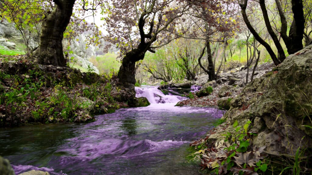
Examples of Good Color Theory


Color Schemes
Now, often the most useful guidelines of color theory are the various color schemes(also known as harmonies) you achieve when utilizing the theory properly. Here they are:
Complimentary: Colors that are opposite each other on the color wheel are considered to be complementary colors. Red and green are complementary colors. This creates high contrast images, but if used too much, can be jarring (so use sparingly).
Analogous: Analogous color schemes use colors that are next to each other on the color wheel. This creates serene and comfortable feeling images. Blue and green are analogous colors.
Triadic: A triadic color scheme uses colors that are evenly spaced around the color wheel. This is a vibrant and exciting combination. Green, purple, and orange are triadic.
Split-Complementary: The split-complementary color scheme is a variation of the complementary color scheme. In addition to the base color, it uses the two colors adjacent to its complement. This one tends to feel less jarring and tense than complementary schemes. An example of a split-complementary scheme would be green, purple, and orange.
Rectangle: The rectangle or tetradic color scheme uses four colors arranged into two complementary pairs. This is a very happy scheme. Using red, orange, green, and blue would be an example of the rectangle scheme.
Square: The square color scheme is similar to the rectangle, but with all four colors spaced evenly around the color circle. Square color schemes work best if you let one color be dominant. An example of a square color scheme would be red, blue, green, and yellow.
Monochromatic: One color in different shades.
How to Use Color Theory in Editing
Color theory shines the brightest in photo editing, especially using Adobe programs such as Lightroom and Photoshop that help make color editing much easier.
Color editing is often referred to as color grading. “Color grading is the process of improving the appearance of an image for presentation in different environments on different devices. Various attributes of an image such as contrast, color, saturation, detail, black level, and white point may be enhanced whether for motion pictures, videos, or still images.”
By using this editing software, you can completely redo or recolor an image, creating your own color scheme that is better suited for your photograph. With this amount of power, it becomes important to understand how colors work together! Most photographs that you see today have been color graded, especially since RAW format images come out very dull and bland color-wise.
In conclusion, studying, understanding, and memorizing color theory is a priceless asset for any photographer.