In your endeavors to create beautiful photographic images, you may want to consider what makes some images more appealing than others. Photography is an art form , it follows the same basic principles of design practiced by painters and designers be it web design, interior design or landscaping.
Regardless of the subject you wish to capture, learning about the basic elements of a photograph, and how they can be arranged together based on the principles of design will assist you in creating much more captivating images.
In this article I aim to share with you the ways in which you can recognise the basic elements of a photograph, and ways to arrange them within your image. Understandably all elements will not necessarily be available in every image, nor are you required to use all the principles of design in every capture.
Once you’ve grasped the basic concepts, you would be able to re-examine your favourite images and to recognize the elements and principles at work.
The six elements of photography
A photographic image is made up of lines,shapes, which have certain values, colors, and texture arranged within a space. You can think of these elements as visual tools/building blocks used to create your image.
These elements are best arranged using the eight principles of art and design which are namely balance, rhythm, pattern, emphasis, contrast, unity and movement.
Color/Hue
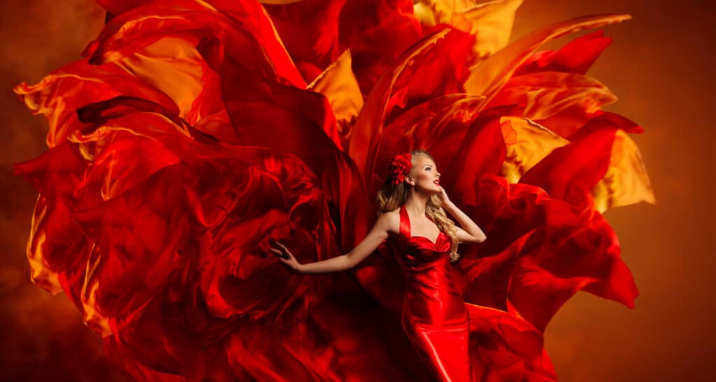
The colors in your image set the mood, evoking a range of emotional reactions in your viewers. When watching a movie, note how the filmmakers have used color to set the tone of a scene, long before any action has taken place.
Color affects us in conscious and subconscious ways, it is this subconscious reaction to color, that advertisers use in product photography, for example to influence our perception of the way the food would taste. Or how powerful a product is.
Additionally color can be used to give emphasis to your subject, by contrasting your focal point to the elements in your image as well as the background. A brightly colored subject within a dark scene will add a sense of vibrancy and life to your image, drawing your viewer’s eye.
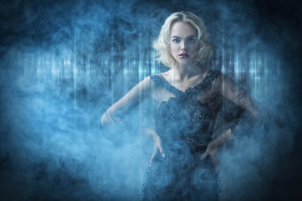
Generally speaking the color red is fast to attract our attention, it evokes feelings of strong passion, anticipation of danger, red is also indicative of power. Pink on the other hand is a color of femininity and innocence. Whereas yellow is usually associated with joy, naivety and at times insanity, blue is a gentle subtle color.
It is worth noting that these are western interpretations of color, for example where black is agreed upon as the color of mourning in western cultures, africans wear white to express sadness, and an african man will have no reservations towards dressing in pink.
Colors are also divided into cold and warm colors, where a warm color feels more inviting bringing us closer to the scene, a cold color indicates distance.
Whether you enjoy playing and experimenting with various color pallets or have a preference for some tones over others learning about color theory and how color will affect your image, will allow you to use it consciously to emphasise the message of your image.
Tone/Value
Tone also referred to as value refers to how dark or light a color is, a color can come in several tones/degrees of brightness. The tonal values in your image are represented by the areas of light and darkness. Value can create the illusion of form , giving the element depth, height, and width, bringing it to the surface.
This is clearest In a black and white image where black is the darkest tone representing absence of light, and white being the brightest, the remaining tones are varying degrees of grey representing shadows, midtones and highlights.
Keep in mind that areas of highlights should not be so bright as to lose all details. Similarly areas of shadow in the image are dark but unlike black they should still retain some level of detail.
An image where there is a great variation in its tonal values from light to dark, is referred to as a high contrast image. Whereas an image where the tonal values are close to each other is considered a low contrast/flat image.
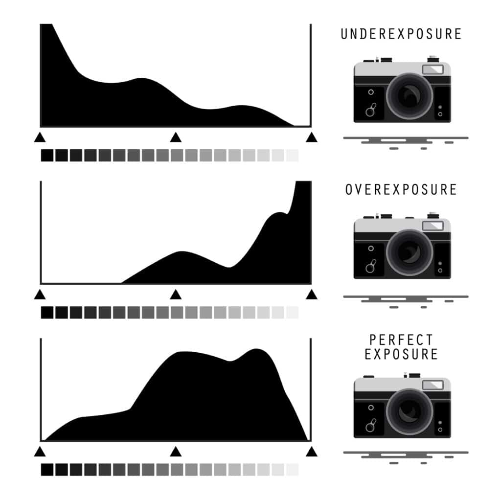
when using your camera’s automatic setting the camera will try to expose for the mid tones. An image with midtones but lacking in areas of highlights, or shadows, feels less dynamic and alive. This is where you need to use your camera’s manual mode, to try and control your image’s lightning and achieve a good level of contrast.
Some cameras will allow you to display the image’s histogram, where you can see how the light is distributed in your image, the mid section of your histogram represents the midtones, while the far right representing white, and the area to the far left representing black.
Lines
Lines are another strong element in photography, learning to use lines in your images effectively can result in powerful images, with strong visual impact. A line is created by connecting two or more points.
When examining the scene look out for naturally occuring lines such as fences, rivers, streams, roads, coastal lines.
Failing that you can emphasise the appearance of lines by the way you choose to angle your camera when composing your shot such that two or more elements can be arranged in relation to each other to form an implied line.
Human eyes are naturally drawn to lines. In photography a line can be seen as a moving point in your composition, directing your viewer’s line of vision by creating a visual path within the image.
Pay special attention to the direction of your lines, your aim is to keep your viewer moving within the image, if the lines appear to guide the viewer out of the image, changing the angle of your camera/shot can address this issue. Additionally lines can be used to imply movement, adding depth or symmetry.
There are different types of lines each of which has a different effect.
Vertical lines
Using vertical erect lines extending upwards toward the sky, in your image can imply, height, power, and gardenour. While thick vertical lines can imply rigidness, and stability. You can also add a sense of depth to your image by including vertical elements at various points in your image such that some appear closer, while others further in the distance.

Horizontal lines
Horizontal lines being parallel to earth when included in your composition would create a relaxed or a calming mood, a sense of motionless rest and peace. Use of strong horizontal elements in architecture photography stresses the relationship of the structure to the land.
A calm day at the sea seaside. The horizontal line at the horizon should be kept straight. A skewed horizon will create a sense of unease, disturbing the sense of calm in the scene.

Diagonal Lines
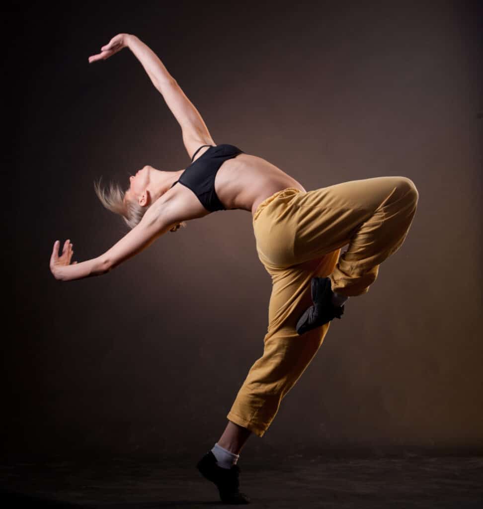
Since diagonal lines are not fully horizontal, nor vertical they appear unstable as if the subject is about to fall , or in a state of motion. As such including diagonal lines in your image will add a sense of movement, fluidity and dynamism in an otherwise still subject.
Additionally diagonal lines can be included to indicate depth, as they pull the viewer into the image creating an illusion of a space that one could move within.
A live figure portrayed in a diagonal/unstable position causes us to feel that the subject is about to move.
Curved lines
Include soft shallow curved lines in your composition to create a feeling of gracefulness, smoothness, comfort, safety, familiarity, or relaxation. Curves similar to those seen in the human form, add a pleasing sensual quality to an image. As well as Slowing your viewer’s gaze as it moves within your image.
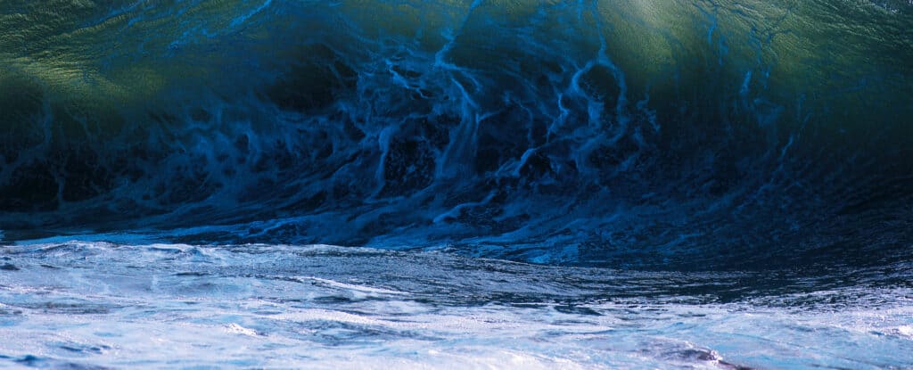
Alternatively sharp deep curves imply confusion, or turbulence, as can be seen in waves during a storm.
Sharp deep curves as seen in wild sea waves.
Converging lines
Converging lines are lines that start as two or more parallel lines that appear to progressively come closer in the far distance. Including this type of lines in your composition can add depth and dimension to your image. Converging lines can be an interesting element in their own right, alternatively you can use these lines to lead to your main subject in the distance.
Note the curved windows and ceiling as well as converging lines leading us further into the image.

Jagged lines
A jagged line is an unevenly shaped line with many sharp edges, such a line creates a sense of excitement and movement within the scene, shifting the viewer’s gaze from one point to the next.
Note how the jagged lines at the bottom of the hill, lead your gaze slowly, out to the open sea.

Shapes and form
- Shapes are a two dimensional representation of an object, an outline of the object using horizontal and vertical lines. Whereas form is a three-dimensional representation of an object, created when the light hits an object creating highlights and shadows, revealing depth, and giving it form.
- Note that frontlighting an object, leaves it flat/two dimensional, use side lighting to enhance the shadows and highlights falling on your object. When working with natural light, plan your shoot at the early hours of the morning, or the hours before sunset to make use of the directional light.
- To further emphasize the shape of an object in your image, you can place it against a netural or contrasting background. Photographing an object against a background of a similar tone and color makes it less visible, attracting less attention.
- When shapes are not easily recognizable, the resulting image is an abstract one. Including objects with clear shapes in your image lends it structure and stability.
Texture
Texture refers to the surface quality of an object, that is to say how the subject feels to the touch, be it smooth, or rough. Textured objects with pronounced details, add to the feeling of depth and volume in an image. Lines, colors and patterns of light and dark/tones can further enhance the texture of an object.

Space
There are two types of space in an image, positive space which is the subject of the image, while negative space, is the area surrounding the subject. This is how we perceive an object as distinct from its background. How the subject relates to the negative space surrounding it should follow the rules of composition.
Negative space is vital to a balanced unified composition. When your negative space is neutral or is highly contrasted to your subject, that can further draw attention to your subject, as well as providing a place for the viewer’s eye to rest. If there isn’t enough negative space around your subject, your image may end up being too busy
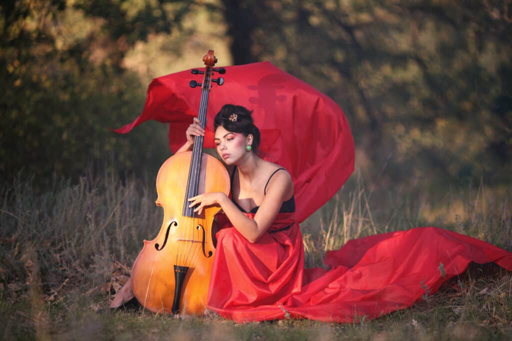
The intense red dress of the violinist(Positive space) stands out against the blurry background (negative space).
The eight principles of art and design (Composition) in photography
The principles of photography come down to composition, and lighting. Where composition refers to the placement of your main subject and the way the supoorting elements of the photograph are arranged around it. While lighting refers to how you feature the light as it falls on your subject
There are around eight principles of composition/design which are namely balance, rhythm, pattern, emphasis, contrast, unity/variety and movement.
As a photographer it is up to you to decide which of these principles will best help you create the image you envision. You will note how these principles intertwine at times and that the use of one will affect the other. As when you would use contrast to create emphasis for example.
Emphasis (Focal Point)
Emphasis in a photographic composition refers to the techniques you would use to arrange the elements in your composition such that the eye is naturally drawn to the most important design element -The focal point- in your image.
Your aim here is to make your focal point stand out as distinct from other elements in the design. An element can gain emphasis in several ways
- Object placement through the application of The rule of thirds & Symmetry
- Contrast through size, color, visual weight, uniqueness,complexity
- Direction/movement
- Repetition
- Isolation
The rule of thirds
When composing your shot, the placement of the elements within that image will influence its visual weight. One of the most basic and popular composition techniques is the use of the rule of thirds.
Keep in mind that an element placed further away from the center of your composition -as dictated by the rule of thirds – would have a greater visual weight.

Movement /Direction
Direction or movement in a photographic composition refers to the viewer’s visual journey within an image, and how to guide the viewer’s gaze towards its main focal point, and inviting the viewer to linger longer.
The direction within the composition can be indicated through the use of elements of photography such as leading lines. Additionally a sense of movement can be created through the use of diagonal or curvy lines, either real or implied.
Emphasis by Difference
While we seek to have harmony and unity within our image, the inclusion of a different/unique element (color,shape,size,texture etc) as our focal point can further emphasise its importance.
Lightning
The direction of the light falling on your subjects is another point to consider when composing your scene.. A scene lit from more than direction would leave the viewer with a sense of unease.

Balance
Balance as a concept is based in our perception of weights and proportions. In a photo composition, balance refers to the visual weight of the elements included in your frame.
There are a number of ways to arrange elements of a design to achieve a balanced feel. depending on the feeling you want to illicit by your image. A balanced image leaves the viewer with a sense of peace, Alternatively you could intentionally create tension by designing an unbalanced composition.
Here are some of the concepts to consider when composing for balance.
- An interesting/unusual element will have heavier visual weight than that of an everyday ordinary element..
- Placing an element to the right side of your composition will give it more visual weight as compared to those elements placed on the left.
- When working with two or more identical elements, those placed at the top of your frame will appear to have more weight than those further down.
- Elements isolated within a large area of negative space will appear heavier.
- Regular shapes will have more weight than irregular shapes.
Symmetrical balance
Symmetry is one way to create balance. However not every symmetrical or linear composition can necessarily achieve balance.
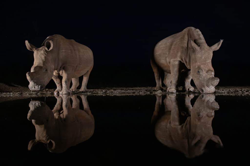
It is easiest to see symmetrical balance in a mirrored image where two elements are almost identical or have more or less the same visual weight. A symmetrical image can be divided into even segments, halves or quarters, up and down or left and right.
Symmetrical balance generally lends itself to more formal, orderly layouts. They often convey a sense of tranquility, familiarity, elegance or serious contemplation.
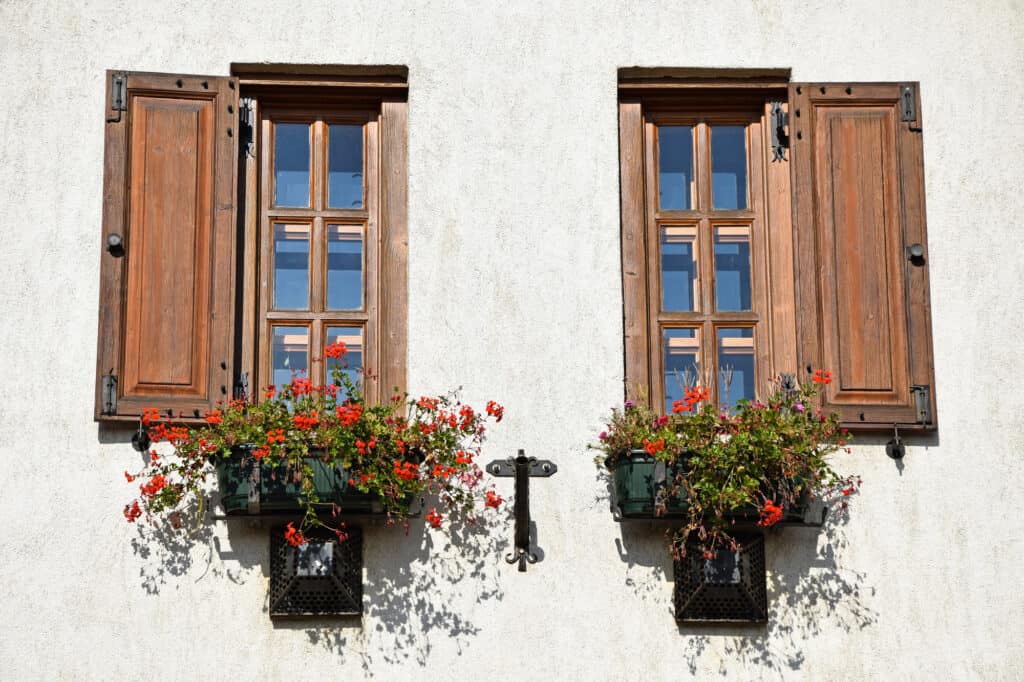
Radial balance symmetry
Another type of symmetry is radial balance symettry, where equally spaced objects congregate around or radiate from a central point.
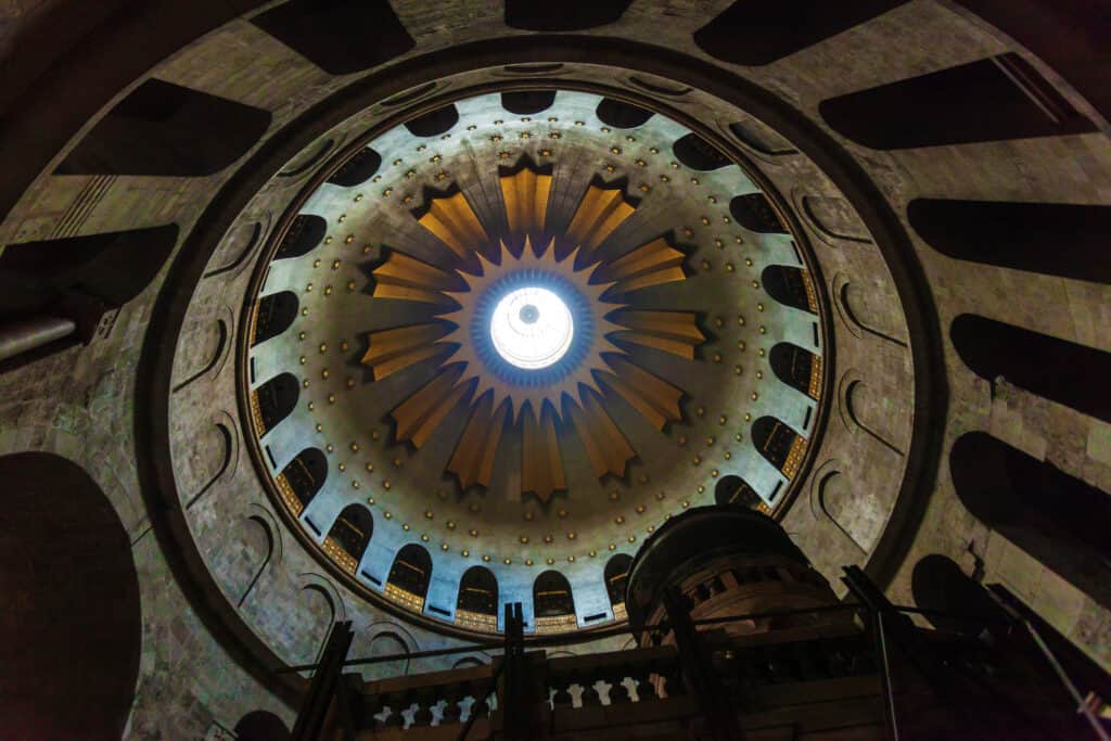
Asymmetrical balance
In an asymmetrical compositions elements are not mirrored or centered. As such balance may not be easily recognized by the viewer, it is more of a general sense that the viewer can feel through your even distribution of the elements within your composition.
Unlike symmetrical balance, asymmetrical balance adds more interest, dynamism, tension, excitement , variety and depth to your composition.
Attempting to create asymmetrical balance using uneven elements can provide you with a variety of possibilities and challenges, when arranging the elements within your frame consider creating contrast.

Crystallographic Balance
This type of balance can be created through repetition, the use of objects that have an equal visual weight.

Size/Proportions
When considering which elements to include in your composition it pays to consider the size of the elements in relation to each other. Larger elements as opposed to smaller elements attract greater attention from the viewer. Including elements of various sizes adds depth and dimension to the image.

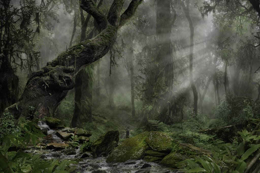
The tree in the foreground, appears to be larger than the trees further behind
Contrast
Contrast is achieved by placing two or more opposing elements against each other.you can add contrast by using some of theses options:
- Contrasting large and small elements, where one large element is balanced with a number of smaller elements.
- Contrasting areas of light with areas of shadow.
- Including contrasting textured and smooth elements, since textured objects appear heavier than smooth ones.
- You may also use contrasting colors, where as an example the color red has a heavier visual weight than that of yellow.

Pattern
A pattern within a composition refers to elements uniformly repeating. Patterns can have a pleasing effect on the viewer. Look out for naturally occurring patterns, such as trees, or flowers or man made objects and structures.
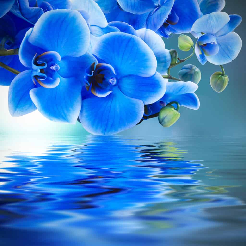
Rhythm
Rhythm within a composition has to do with the distribution of the elements within an image. This can be created by implying movement through repetition the recurrence of elements in an organised manner. Unlike patterns, elements here need not be uniform, rhythm rather relies on the variation between the elements.
Unity/variety
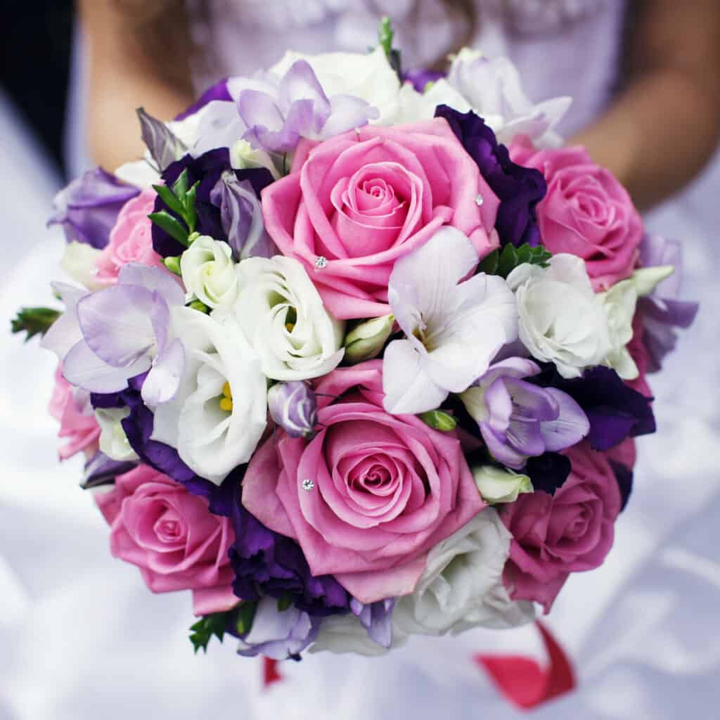
Unity in a photographic composition refers to the visual relationship between the various elements in a photograph. Unity in composition aims to create a cohesive image. There are a number of ways to create unity within an image such as:
- Using a color palette of similar colors or tunes.
- Correctly exposing the image to avoid areas of extreme highlights and underexposed areas
- Having a clear concept of how the elements included in the image relate to each other harmoniously with enough variety to avoid ending with a scene that is overly monotonous.

The harmonious color palette and the naturally fitting elements create a feeling of unity.
