

As much as you’d expect photography to be a camera and a lens, photography is also full of charts and graphs! One is a histogram, a commonly overlooked feature that can prove very useful. Whether you’re a hobbyist just starting or a professional that has not taken advantage of this novelty yet – here is our guide to histograms and how to read them properly!
What is a Histogram?
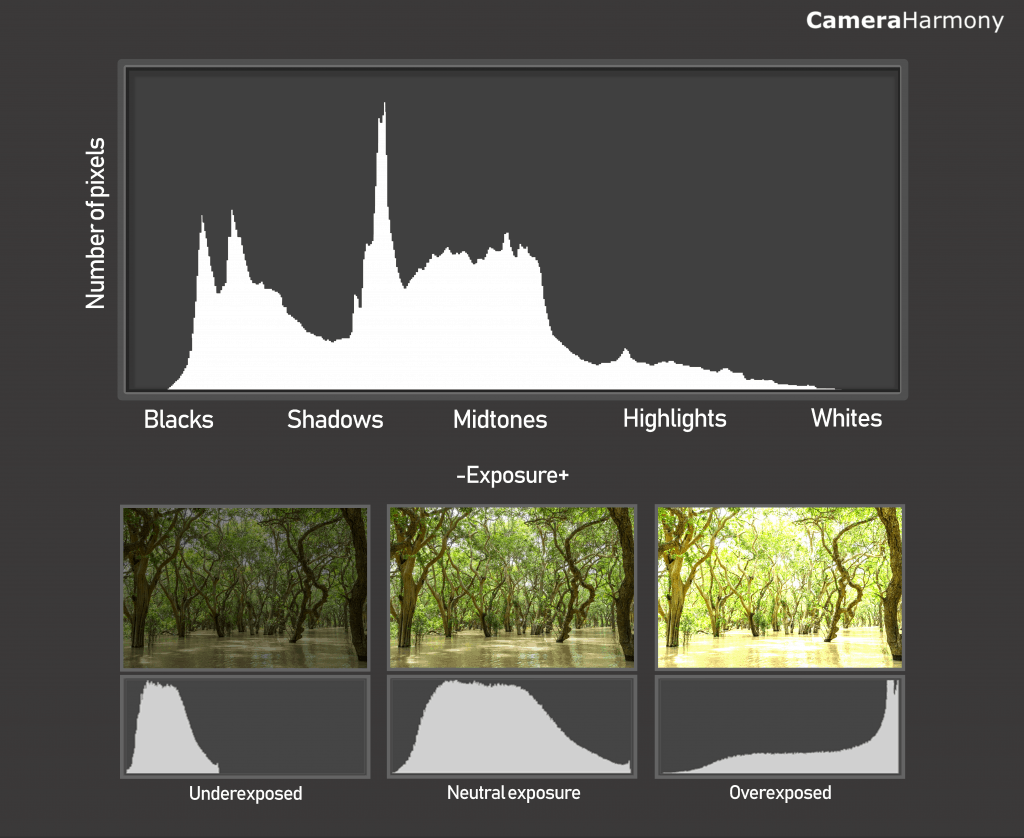
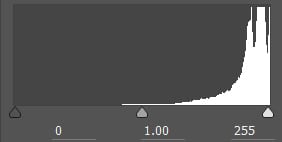
A histogram is a graphic representation of how light is distributed in your image, such as the shadows and the highlights.
Often shown as a chart with mountains, the histogram will show you how bright each pixel in your image is, ranging from black (0% brightness) to white (100% brightness). The pixel is the smallest element in an image. Pixels make a digital image a digital image, and this small unit is the light photons striking at that point that make a picture. This directly relates to how many shadows, mid-tones, luminosity, and highlights are seen in a photograph.
The histogram is directly related to your exposure settings. The brighter the exposure, the lighter your histogram will show. That being said, the histogram can tell you whether or not your exposure is good (often showing that automatic exposure from the camera is bad! Better control exposure yourself!).
Where Do You Find Histograms?
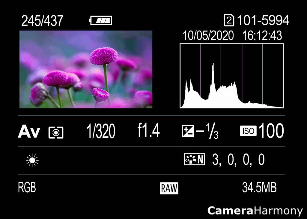
Histograms can be found both in your camera and in your editing software.
You can view the histogram in your camera by toggling the screen display. On most cameras, such as Canon and Sony, you change the screen display by pressing the top of the spin dial on the body of your camera located directly next to the big screen. Click it enough times, and you should see a histogram on your screen’s side. Otherwise, refer to your camera’s manual for more information.
For editing programs such as Adobe Lightroom, Adobe Photoshop, and more- the histogram should be located at the right of your screen by default. If it is not, go into the View or Window settings, and you can select to view your histogram.
How to Read a Histogram
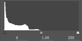
Histograms may initially look foreign and confusing, but they’re not complicated.
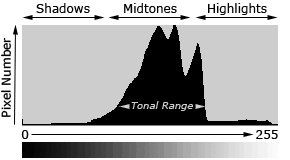
Firstly, the left side of the graph represents the blacks (your shadows), the middle represents the mid-tones (grays), and the right side represents the whites (highlights).
The mountains tell you how much of the shadows, mid-tones, and highlights are present and to what intensity. The higher the mountains, the more intense the blacks, whites, and grays. The lower, the less they are present.
So, for example, if you see that the middle of the graph is clustering with mountains, your image has more grays than it does blacks or whites, and visually, your image will not have much contrast.
If your histogram shows most of the mountains on the left side, that means your image has a lot of blacks and intense blacks, so your photo will likely look pretty dark. Likewise, if your histogram shows mountains more on the right side, the opposite is true- more whites in your image, and it’ll look much brighter!
You can tell if your image is overexposed, underexposed, or just right based on where these mountains are located. A good exposure features mountains going reasonably evenly distributed from left to right.
Conclusion
Histograms are helpful tools that don’t get enough credit! Using a histogram, you can make your image look more exciting and dynamic. Although photography shouldn’t just be a logical calculation of technique, using these available features to improve your work is helpful!