Composition is one of the fundamental principles of photography. Without good composition, your image is no better than a spontaneous snapshot! Composition is the arrangement of elements in a shot. Arrangement refers to everything in your picture, from the mountains in the background to your subject in the forefront. Good composition compliments your image, and makes your photography stand out.
With composition laying the foundation for effective images, it’s one of the hardest aspects of photography to master. Besides having an innate sensitivity and understanding of this subject, composition also has rules to follow. Bad composition will cause the audience to turn away from your work, so this is certainly not a subject to ignore.
How Composition Affects the Viewer
Composition directly affects the viewer- whether they know it or not! Even if someone isn’t artistic, they may feel something is off or wrong about an image if it is not well composed. Composition can be pleasing or it can be poor. Pleasing composition is easy on the eye and attracts people to look at your photograph. Poor or bad composition looks awkward, doesn’t attract viewers, and tends to shy people away from an otherwise good photograph.
Bad composition can also take away from the message, story, or concept being presented in an image. For example, if a photograph is filled with distracting elements that confuse the subject matter, the audience won’t be able to understand the image. If the composition is too plain, then maybe the idea wont express itself in the best way. Composition has to be chosen to compliment the image, not detract from it.
Likewise, good composition has a very positive effect on the audience. If you’re in a gallery or photography competition and your image has the better composition, the crowd will be more attracted to your work than the other pieces (therefore bringing your work to the forefront). Good composition can also help get clients, as potential interested parties may be swayed to work with you if you have a very solid portfolio.
Composition is certainly not an element to be forgotten about!
How Composition Affects the Story in a Photograph
Because composition describes how your subject is placed in relation with everything else in the picture, composition can be used to tell a story. You can correlate emotional responses to images with composition, so use this to your advantage.
For example, an image that expresses the darker emotion of, say, anxiety can be created by cropping an image extremely tight around your subject (therefore making the shot feel claustrophobic). This can express anxiety.
In contrast, capturing an image with a concept of freedom can be done by taking a very wide shot of a subject with lots of negative space. Negative space is any area in an image that doesn’t hold the subject.
Composition Goal: Lead the Viewer Around the Frame
The most effective compositions are the ones in which the viewer looks around the frame and then lands right on the subject. This might sound silly, but the goal of composition is to keep the viewer interested and engaged, and a big part of that is making sure that the viewer understands who or what you are trying to show them.
If your viewer only spends seconds on your photograph, it’ll be forgettable. If they spend minutes, they’ll remember it.
You can help the viewer move around the frame by how you use color. Try to capture images in which the colors of the subject also tie in with colors that are sprinkled around the frame! For example, if you’re capturing fashion and the dress is purple- try photographing the model in an area where there are some purple flowers in the corner of the composition to lead the eye around.
A good way to achieve this goal is to use the Golden Ratio, that we will describe below.
Common Compositional Rules
There are several common compositional rules to keep in mind when planning your shot. Of course, there are situations in which the rules should be broken because they do not apply… but in order to do so effectively, you must first understand what the rules are.
The Rule of Thirds

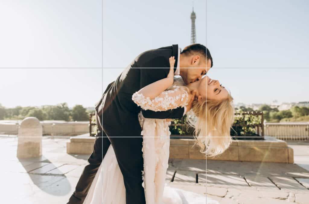
This is the most basic compositional rule. If you divide your photograph evenly into thirds, both horizontally and vertically, the subject of the image needs to be placed at the intersection of the dividing lines. Any of the intersections! But it must be at an intersection.
The idea is that this provides the most accurate amount of negative space.
Not all compositions fit perfectly within the rule of thirds however, and this is especially true with action photography. Action photography has an implied sense of movement. Which leads us to our next rule…
Send of Implied Movement

Implied sense of movement means the direction that you think the movement will go in a still image. For example, if a dog is running to the left in a picture, the implied sense of movement is towards the left. If a model is looking to the right, the implied sense of movement is to the right. If the subject is looking into the camera, the implied sense of movement is towards the viewer.
How this factors into composition is that you always want to leave more negative space in the direction of implied movement. This keeps your photograph from feeling claustrophobic or too abruptly cropped.
The Golden Ratio

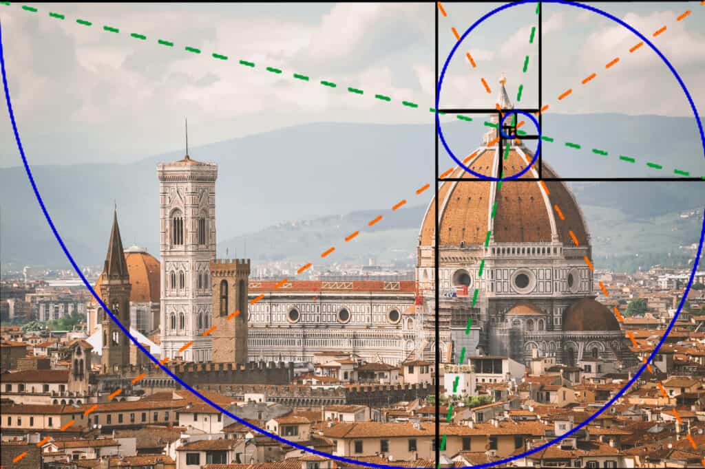
The Golden Ratio is one of the oldest compositional rules, and applies to so much more than just photography. The Golden Ratio can be found in painting, architecture, and engineering.
It is a design principle based on the ratio of 1 to 1.618, which is denoted as ‘the perfect number.’ This stems from the Fibonacci Spiral, which was created from a series of squares using Fibonacci’s numbers, with the length of each square being a Fibonacci number.
A series of diagonal points on each square will then create a path for which the spiral can flow through the frame. Using the spiral as a tool to compose a photograph will allow the viewer to be led around the image in a natural flow.
Leading Lines

Leading lines are parts of your composition that cause the eye to follow a line all the way to your subject. Many achieve this by capturing models near architecture that leads directly to the subject! You can do this with various lines in a picture. Make sure all of them point towards your subject.
Framing

Framing is when the subject is in a ‘frame’, achieved by using the composition to circle around your subject. You can frame your subject by placing them in a doorway, under an archway, or maybe between two trees! There are many ways to do this, and you can get very creative with it. This is a very easy way to bring attention to the exact part of the image you want to highlight.
Symmetry

When photographing non-living subjects such as landscapes, look for symmetry and patterns in your frame. The human mind and psychology naturally gravitates towards repeated information, such as the design of a bridge. This creates a very visually pleasing and satisfying photograph.
Common Compositional Mistakes
Of course, compositional mistakes run rampant in the industry- so it’s a good idea to be well informed to ensure you don’t make these mistakes!
Don’t Cut Off Limbs at a Joint
If you’re photographing a living subject, such as a person or pet, don’t cut off any limbs! That looks like you purposefully handicapped your subject. If you have to crop tightly, never crop at a limb joint- always crop in the center between two joints.
Bad:

Good:

Leave Enough Room Around the Subject
If you crop an image too tightly, your subject will look short, squished, and uncomfortable. Try to leave a moderate amount of space around the subject.
Bad:

Good:

Cluttered Image
Sometimes, photographs have way too much going on and it’s difficult to focus. Try to avoid cluttered compositions, less is more!
Bad:

Good:

In conclusion, composition will make or break your work- so it’s important to train yourself in the art of good compositions!
